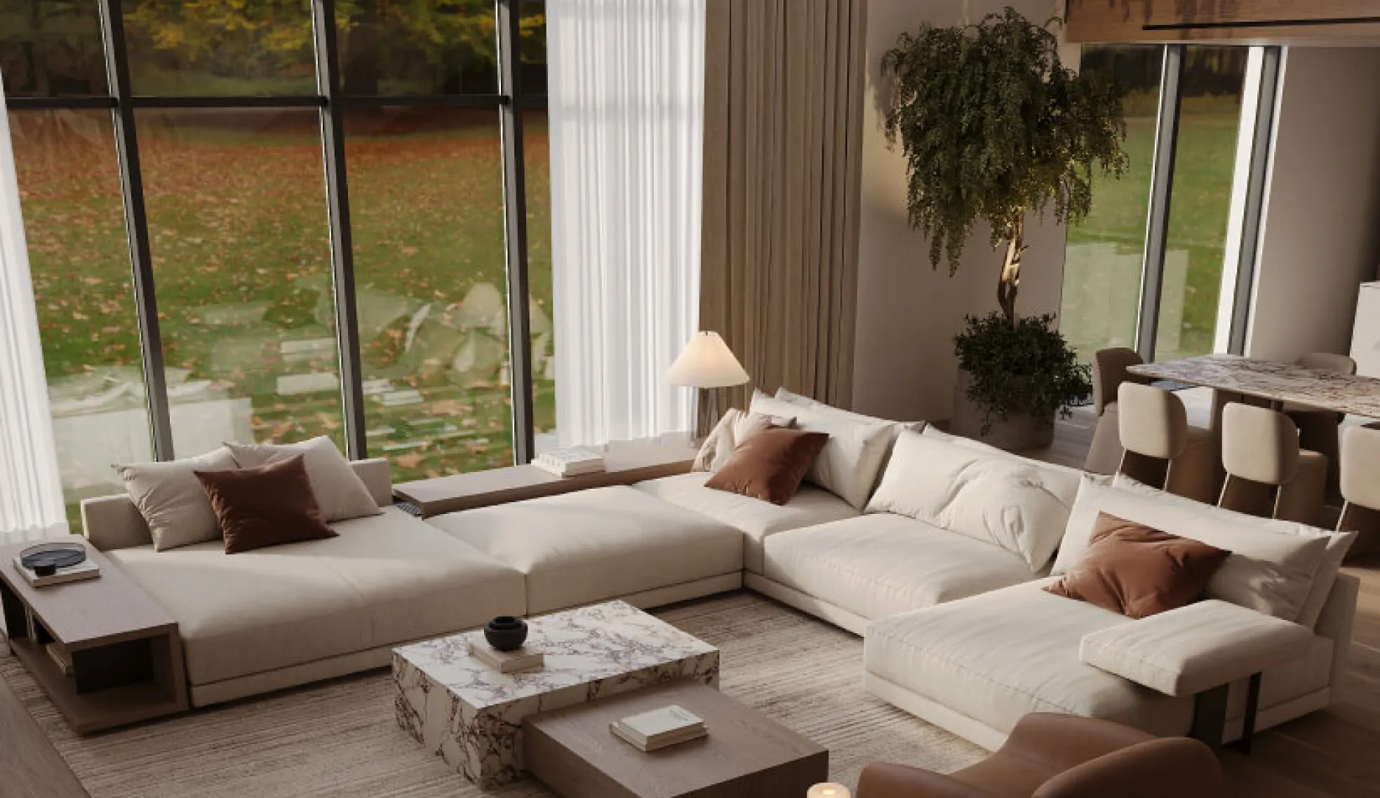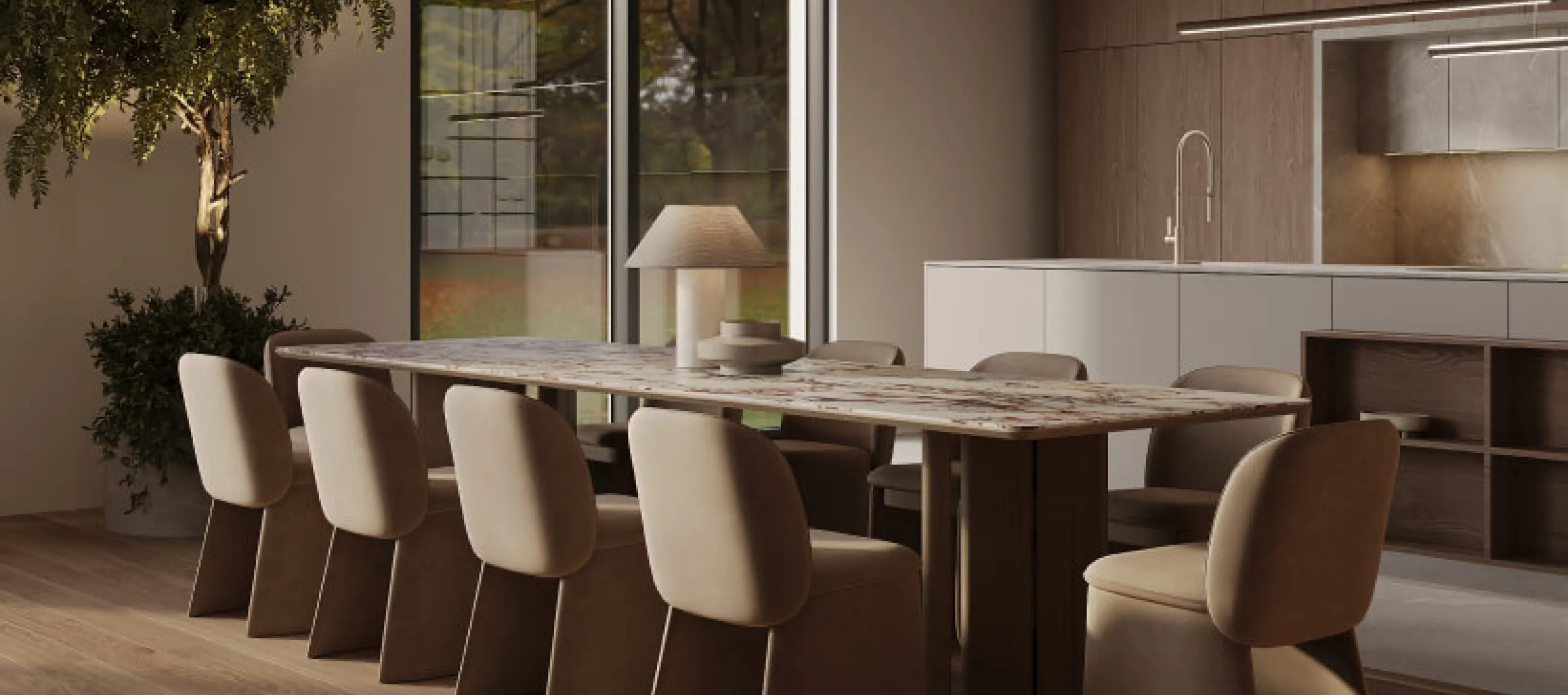

Why do some interiors feel luxurious with very little decoration, while others are full of expensive furniture, stone and designer lighting yet still feel flat?
The price of each piece often has less to do with it than how colour, materials, texture and light work together.
Finding beautiful materials is just one step. One of the hardest parts of designing an interior is getting those materials to work together.
That’s often what makes the difference between a room that looks good in individual photographs and an interior that feels cohesive as a whole.
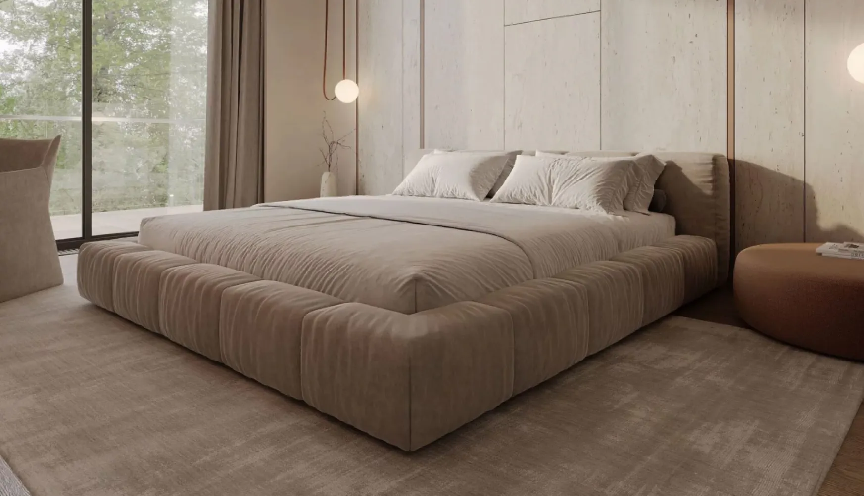
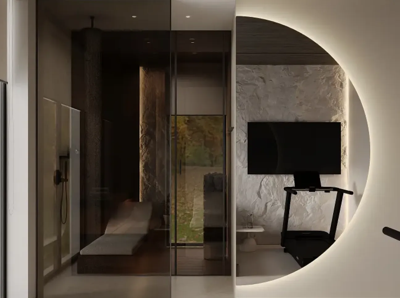
Why can an interior built around a single material feel flat?
Imagine a room where every colour matches perfectly.
- Smooth cabinet fronts
- Smooth flooring
- Smooth walls
- A sofa with smooth upholstery
Even if everything is of high quality, the room can still lack depth. Our eyes need variety.
We experience a space through colour, light, shadow, texture and the way surfaces reflect light. A well-designed home rarely relies on a single texture. Combining a few distinct materials that work together creates a more interesting result.
Rule 1
Choose your base first
Before picking out ten beautiful materials, decide what will anchor the interior. Your starting point might be one of these.
- Warm-toned wood
- Natural stone
- Off-white
- Warm beige
- Muted green
The base sets the tone for the whole space. Accents come later. Without that foundation, even beautiful materials can end up competing for attention.
Rule 2
Use the same colour across different materials
This is one of the simplest ways to create an elegant interior.
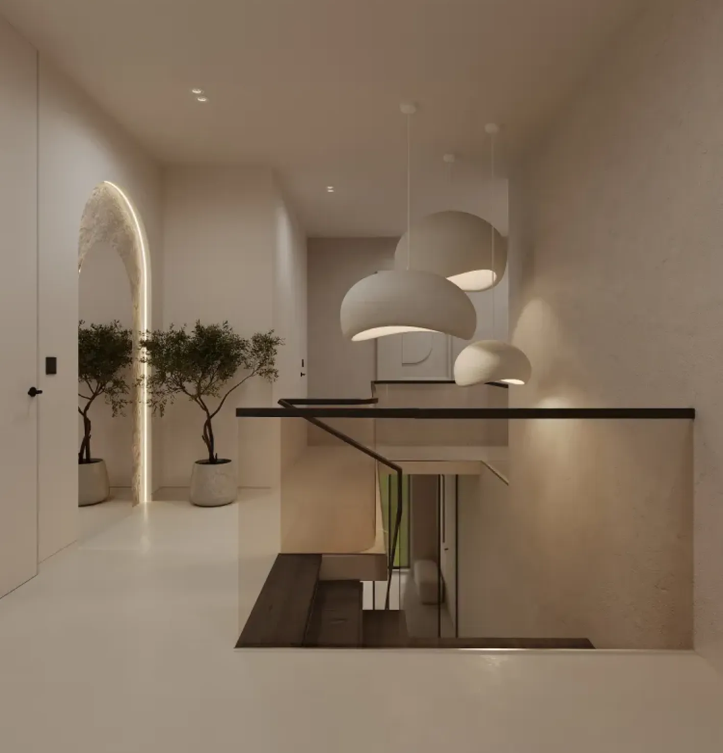
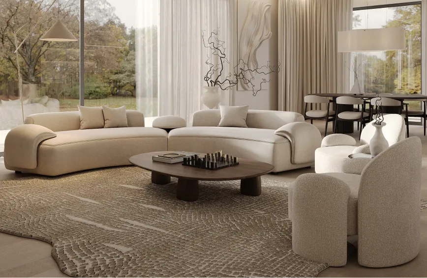
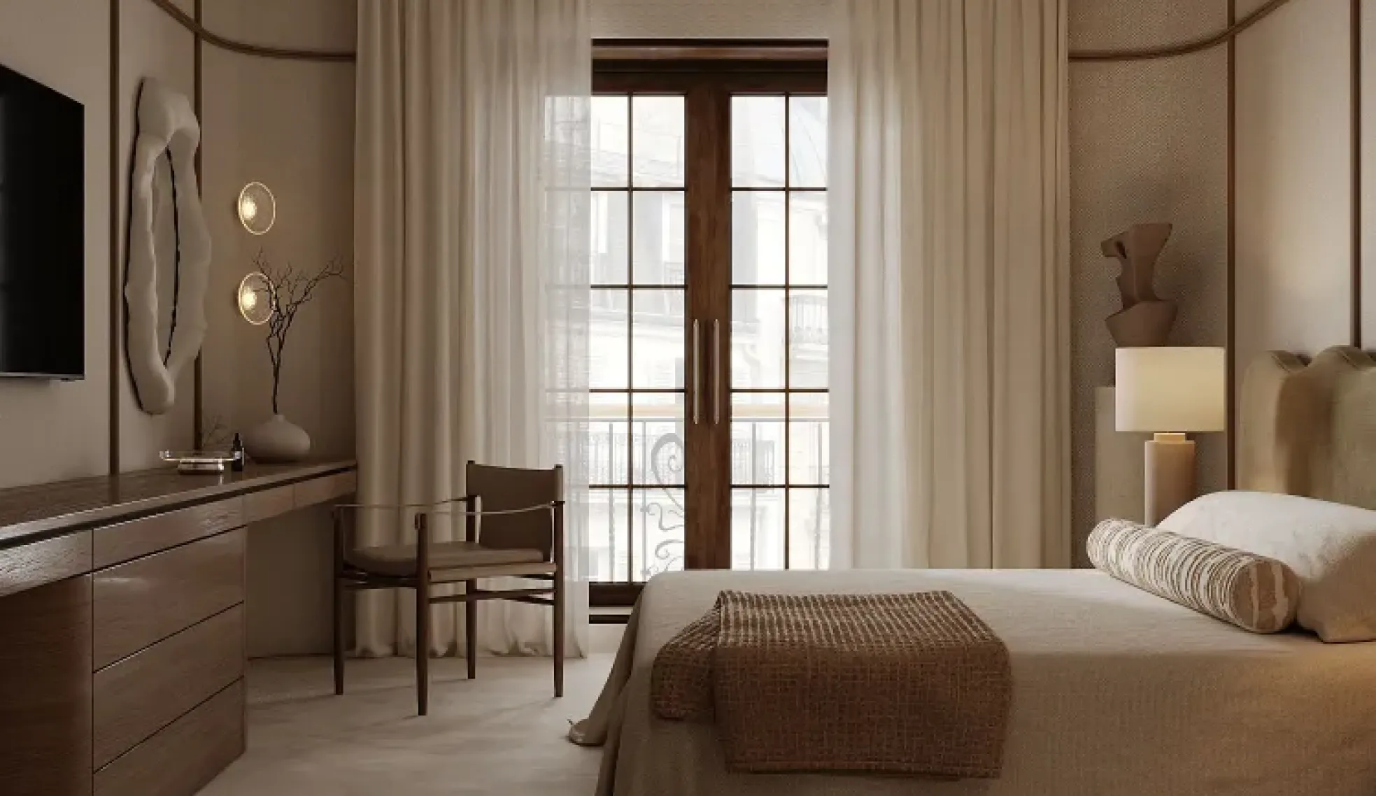
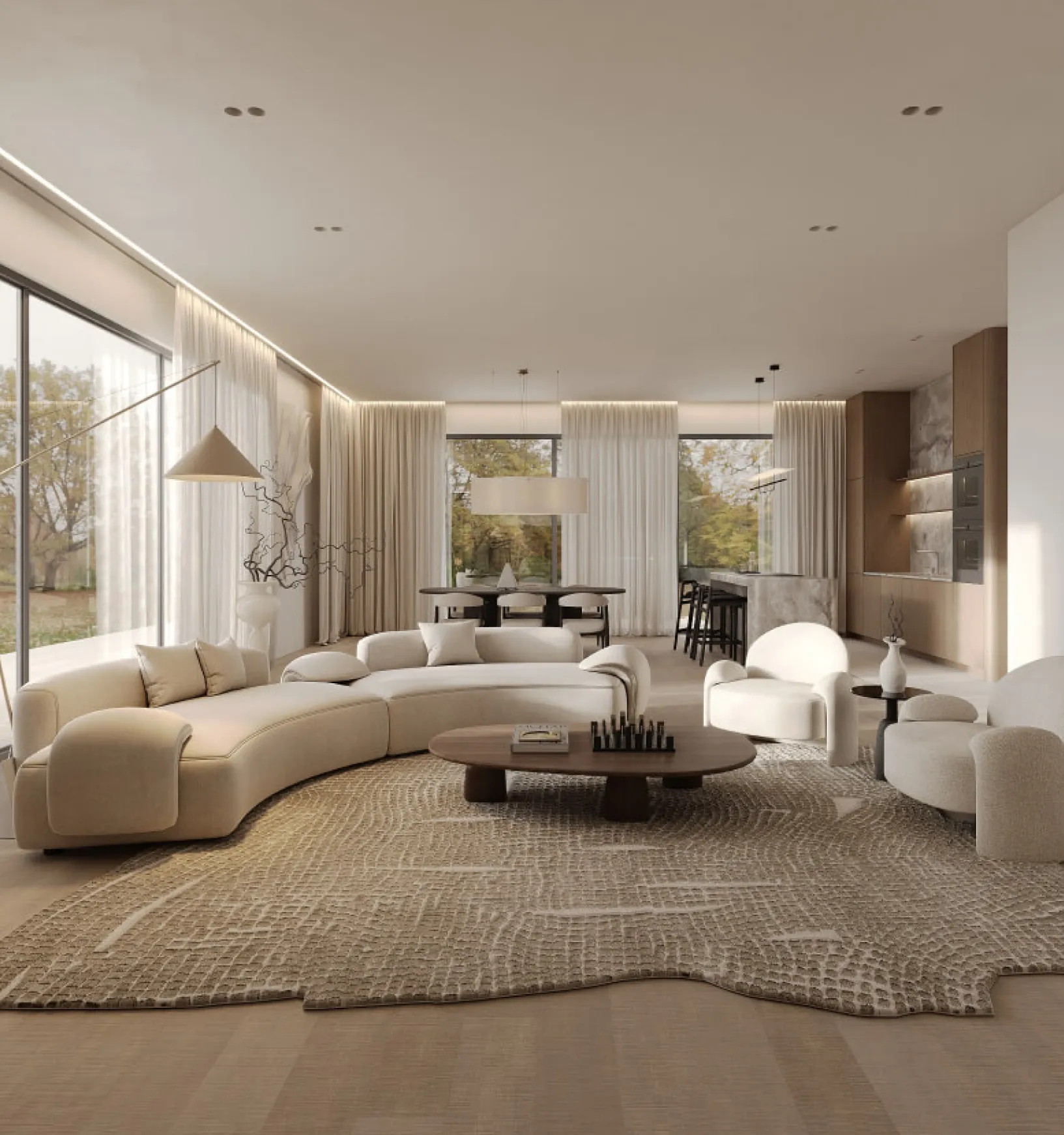
Imagine a space in shades of beige, with beige plaster, beige stone, wool textiles, matt ceramics and warm-toned wood. The palette stays cohesive, while each surface catches the light differently. That variation keeps the room interesting.
Contemporary interiors increasingly use subtle differences in texture to create contrast within a restrained palette.
Rule 3
Pair matt and glossy finishes
Different materials interact with light in different ways.
Matt surfaces soften reflections.
Polished stone reflects light.
Metal catches it in small, bright highlights.
Glass adds a sense of lightness.
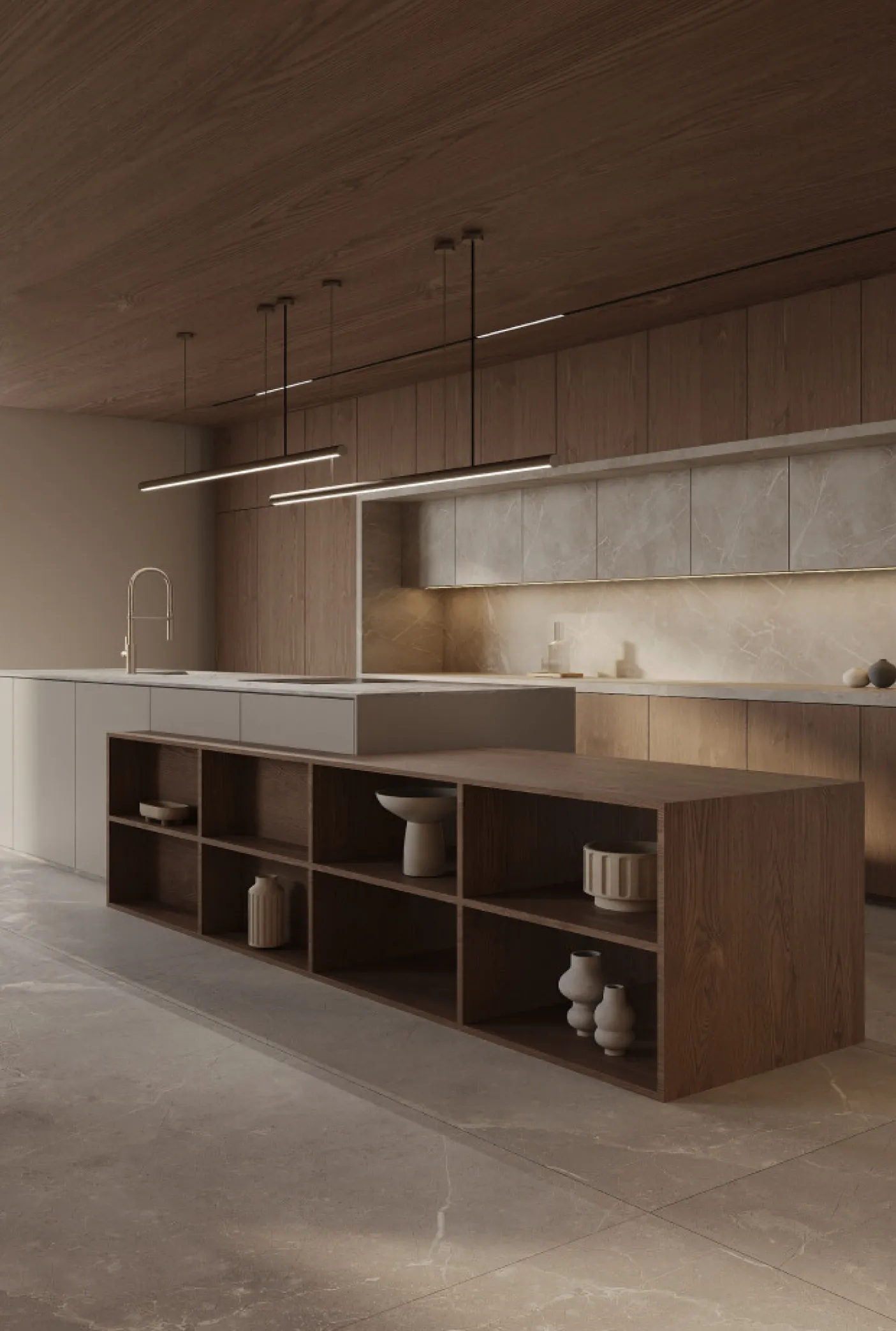
Even two materials in similar colours can look very different. In a kitchen, for example, pairing matt beige cabinet fronts with a stone worktop that has a subtle sheen can create more depth than using the same finish on every surface.
Rule 4
Make room for dark materials
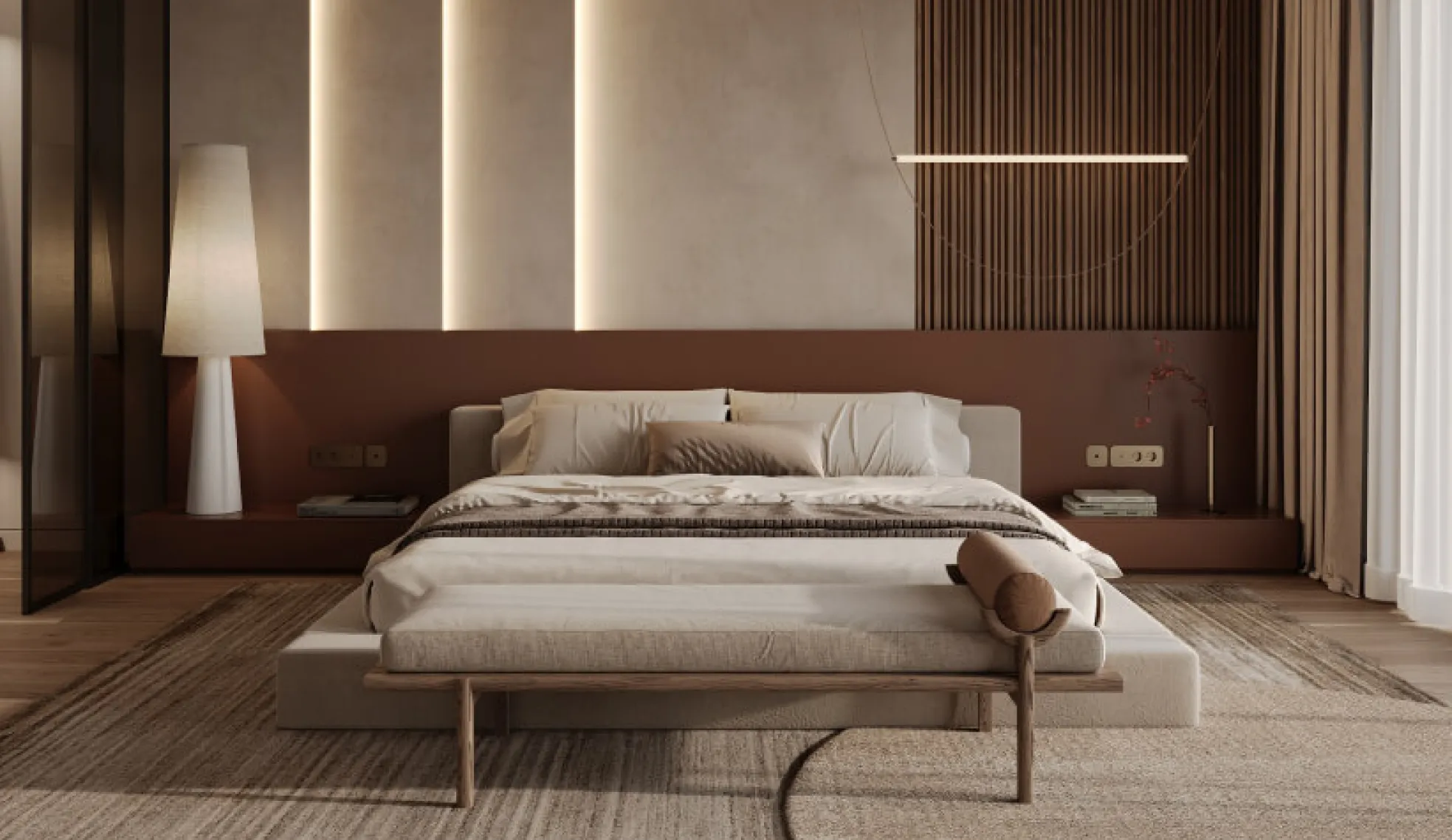
Clients often worry that a dark colour will automatically make a room feel smaller. A dark wall, richly toned wood or a striking stone can make a space feel more elegant, intimate and distinctive. Much depends on the lighting.
Under strong overhead lighting, a dark wall can feel heavy. Soft light from the side can bring out its texture and make it the most interesting feature in the room.
“We often find that clients are wary of dark colours before we’ve even seen them in the space itself. What matters most is what we pair a dark colour with and how we light it. Those choices determine whether the room feels heavy.”
— Interior designer at Line.Projekt
Rule 5
Limit the number of main materials
Treat this as a starting point and use your judgement. A kitchen with marble, two types of wood, terrazzo, several metals, glass, coloured tiles and several other textures can quickly become visually tiring. Choose a few main materials and repeat them consistently throughout the space.
Wood + stone + metal is one possible combination. Everything else can recede into the background.
Why do luxurious interiors often feel calm?
The eye has somewhere to rest when only a few elements draw attention. A well-designed home can use expensive materials selectively, give feature walls room to stand out and carry the same colour through several rooms.
A few statement pieces can be enough. Sometimes the most luxurious choice is deciding which ideas to leave out.
Colour always depends on light
This matters especially when choosing materials. The same beige can look pinkish, yellowish, grey, almost white or considerably deeper. Its appearance depends on daylight, which way the windows face, artificial lighting and the materials around it.
A small sample in a shop can give a misleading impression. An interior designer assesses colour in the context of the space where it will be used.
Choose materials together
A well-designed interior starts with the space as a whole. Whether you’re designing your home or a commercial interior, consider how all of these elements will work together from the start.
- Flooring
- Walls
- Doors
- Kitchen
- Stone
- Taps and plumbing fixtures
- Furniture
- Textiles
- Lighting
When you choose each element separately, it’s easy to end up with beautiful pieces that don’t work together. Bringing them into a cohesive whole is where the interior designer’s work really begins.
Repetition is one of the simplest ways to create cohesion
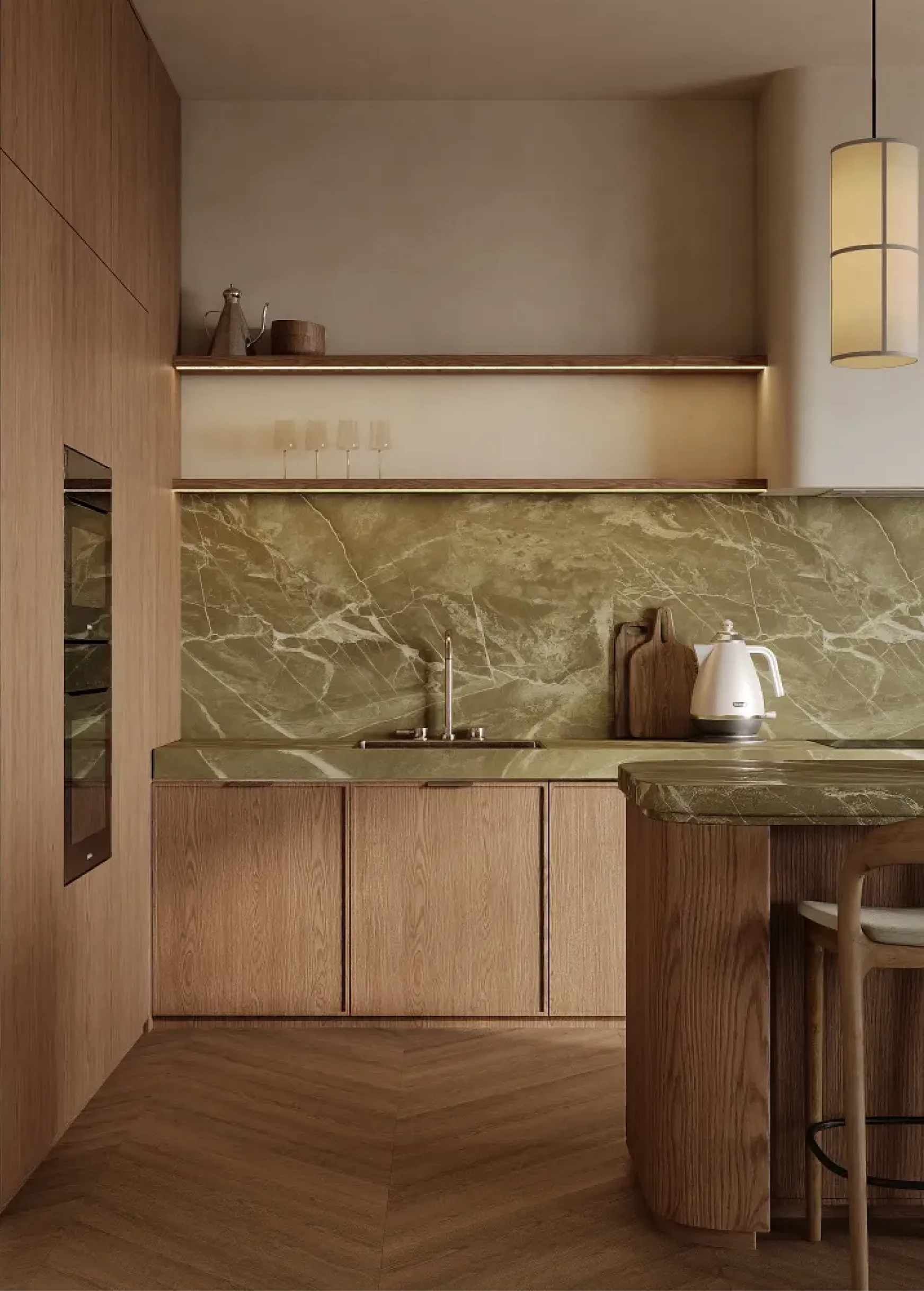
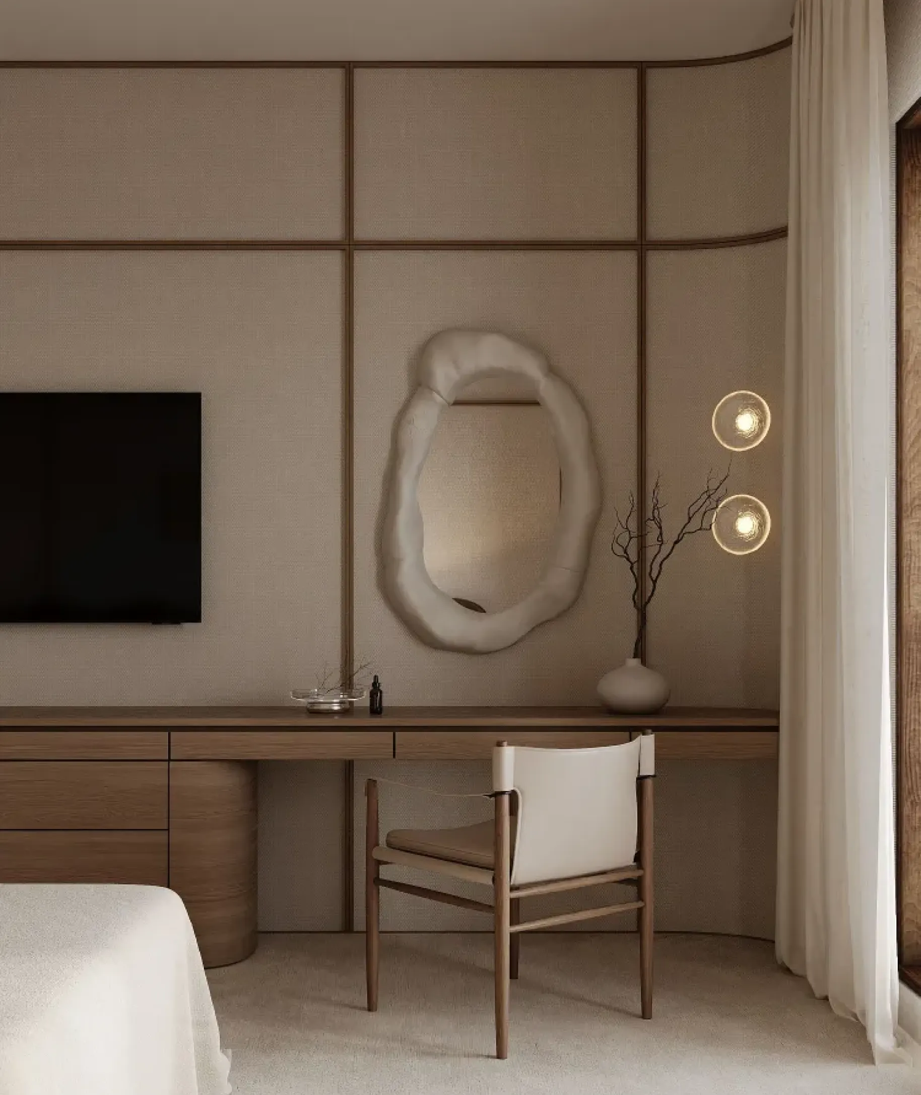
If you use a warm-toned metal in the kitchen, you can repeat that finish in a light fitting. If you’ve chosen a particular shade of wood, you might use it again in built-in cabinetry or another piece of furniture.
If the bathroom features stone with a distinctive colour, a small detail in a similar tone can echo it elsewhere in the flat. These repetitions create a visual rhythm that makes the interior feel considered, even if you can’t quite put your finger on why.
“A designer’s job is to choose materials that work together. Sometimes the hardest part of a project is deciding what to leave out so the rest can come together.”
— Interior designer at Line.Projekt
What does this look like in a real project?
Suppose we’re designing a home or an office. The client wants a calm, contemporary interior in neutral colours.
We can build the palette around warm oak, off-white, stone with a pronounced texture, wool textiles, dark metal and one deep accent colour.
The interior still feels calm, but it has more character. Its appeal will last beyond the popularity of any one colour.